Our Program
Grief.News provides hospices and funeral homes with an unsurpassed grief-support newsletter that serves ALL of your grieving families and allows your bereavement team to focus on those families needing greater attention.
For hospices, the Grief.News newsletters take you much of the way toward complying with your bereavement support requirements. For both hospices and funeral homes, our newsletters are also a powerful marketing tool directed at one of your most important constituencies — the families who have already used your services.
Your support in this crucial year after hospice or after the funeral, maintains and bolsters your company, enhancing return clients and word of mouth.
Grief.News makes the process easy for your hospice. Most of the work has already been done, and we handle most of the rest of it. We recognize that you’re not in the publishing business; we are. In fact, once your simple onboarding set-up is complete, you can get a bereavement newsletter delivered to you with almost NO work required on your part. You merely have to provide an Excel mailing list each quarter to have a bereavement newsletter for years to come.
For hospices, read “A Newsletter with Many Uses Beyond Bereavement” to learn about the versatility of the Grief.News newsletters, especially the added value of our COMMUNITY ISSUE, an adaptation of the Hospice Issue designed for outreach, education and working with present and potential referral partners.
• • • • • • • • • • • •
When the time comes, four QUARTERLY ISSUES follow the Hospice and Transition Issues, mailed at regular intervals over the course of a year to everyone on your bereavement mailing list.
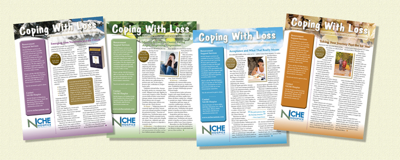
CUSTOMIZING — Every issue is branded with YOUR company’s logo and YOUR choice of name for the publication. Through our Onboarding Set-Up, we take the next steps to make a Grief.News newsletter YOUR newsletter. We research your website to develop the descriptions of your company and your bereavement support services.
• • • • • • • • • • • •
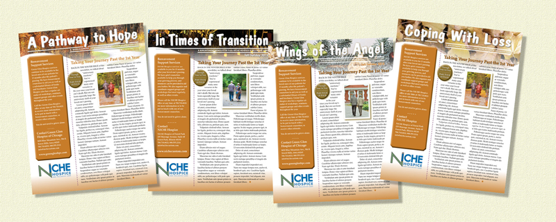
AND FURTHER CUSTOMIZING — Do you want more than just color for your bereavement newsletter’s banner, as shown in the earlier slides? You can have picture banners, such as these photographs, that visually carry the reader through the year. We have a library of images to make your newsletter fit your region or to fit themes that tie in with your company’s name, image or mission.
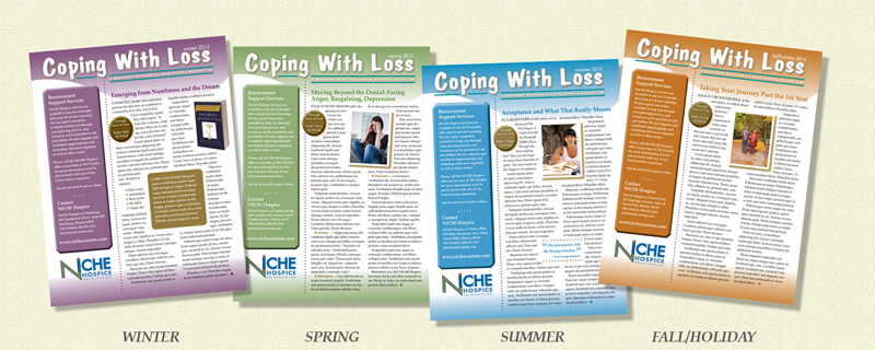
“THROUGH THE 1ST YEAR” — This multi-part series appears on the front page. The series is in 5 Parts, the 1st appearing in the TRANSITION ISSUE, followed by Parts 2-5 in the Quarterlies. With this series, Grief.News further customizes by targeting each family at the phase they are experiencing. Families that begin their year with the WINTER ISSUE (at left) complete the series with the FALL/HOLIDAY ISSUE. Families that begin their year in the Spring complete the series in the Winter, etc.
We also have crafted a series of “Messages,” discussed a couple of slides up, that further enhance the timeliness and personal attention of your bereavement newsletters by addressing the reader directly about their phase of grieving.
• • • • • • • • • • • •
AND YET MORE CUSTOMIZING — Here you can see how Grief.News newsletters adapt to your requirements in offering photo banners. Fall leaves don’t fit your locale or theme? Then have Sunbelt luminaria, or a Christmas tree angel ornament, or images tying in with your own marketing materials. Note again, as well, that your newsletter’s name is your choice. That said, Grief.News has been publishing bereavement newsletters since 2008. So, we will be able to offer you options, so decision making will be quick and easy.
• • • • • • • • • • • •
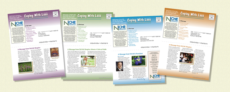
AND FINALLY, MORE CUSTOMIZING — The back page of the bereavement newsletter, which includes the envelope panel on its top half and content space on the bottom half, offers additional space for customizing. As shown here (blue example), you can include a masthead list of personnel, for the company or specific to each site (recommended only for organizations with little turnover). Our “Message” feature adds a personal touch. It can come from your organization in general or from a particular person. We offer Message columns from our article bank, or you can work with us to customize these Messages.
• • • • • • • • • • • •
WE CAN HANDLE ALL OF YOUR MAILING — In conjunction with our printing/mailing-house partner, Grief.News simplifies your work by taking care of the whole, complex mailing process.
Shown here is how your Quarterly Issues are delivered, folded to 8.5″x5.5″. As delivered, the envelope panel is on one outer side of the mailer and the Message, as shown in the previous slide, is on the other outer side of the mailer, before the reader even opens the publication.
• • • • • • • • • • • •
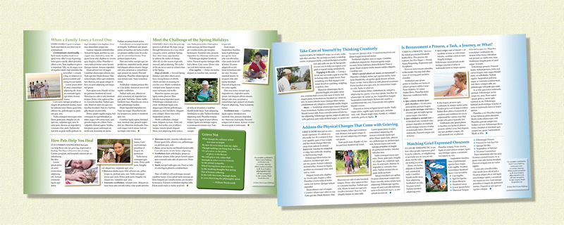
OUR INSIDE SPREAD OF FEATURE ARTICLES — Readers open a Grief.News bereavement newsletter to find 3 or 4 articles on a range of topics presented on the inside spread. Some articles are timeless. Others are written to address issues that fit the season. The crucial Fall/Holiday Issue is entirely about a variety of holiday concerns. Read the Article Lineup.
In all cases, the articles are written to be concise and focused on their main topic. Most are 250-450 words, rarely exceeding 500 words. Articles never carry over from one page to another. We recognize that people who are grieving tend to have shorter attention spans and less focus.
Now, let’s talk about how Grief.News and your organization can work together to raise the level of your grief support to all of your families and of your marketing.

